Quote:
Originally Posted by Casull

I think I finally pinned down what I don't like about the interior of the concept. I have never really been able to put my finger on it, but I just thought something was not right about it. Other than the color in the coupe, I think what is bothering me so much is the very flat and modular look of the dash. I prefer an interior that wraps around the driver. The interior in the concept doesn't do a good job of separating the driver and passenger areas.
The way they used the interior space seems very "retro" to me, which may have been their intention, but it isn't very inviting. I think if they just redisigned the console area and made it wrap around the driver more it would give the interior a much better look...
Does anyone understand where I am going, or am I just blathering?
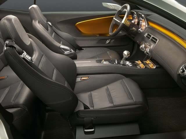 |
I know what you mean. I think the center console guages has alot to do with the concept's interior not separating the driver from the passenger very well. The whole dash area seems void of instrumentation, other than the two large guages for the driver. There's too much empty space on the dash due to the console guages. But Bob Lutz says the console guages are going to stay. Personally, I could do without them. Plus I hope they use a different method of implementing the sound system. The two large knobs radio and CD in the center are way too simplistic. They have to do a better job with the stereo placement on the dash.